
Choosing Cabinet Colors: White, Greige, Navy and Green
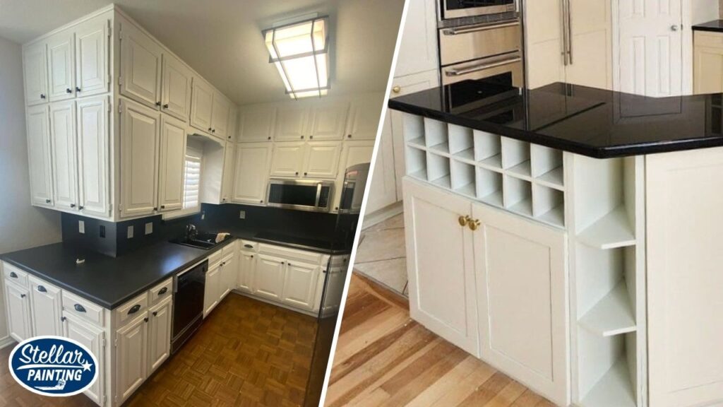
Cabinet color is the biggest single decision in a kitchen repaint, and it is permanent enough that it deserves more thought than a trend. Stellar Painting paints kitchens across Fort Worth every week, and the colors fall into a few families: white and off-white, greige and warm neutrals, and deep navy and green, usually on an island or lower cabinets. Here is how each one lives in a real kitchen and how to choose with the finishes you are keeping.
Start with what stays
Counters, backsplash, flooring and appliances set the palette. Warm granite and travertine lean toward warm whites and greiges; white quartz opens up cool whites and bold colors; dark wood floors can carry a white kitchen or a deep island. Bring the cabinet decision to those finishes, not to a photo of someone else’s kitchen.
White and off-white
Still the most requested, for good reason: bright, timeless, resale-friendly, and a clean backdrop for any counter. The choice within white matters:
- A warm white (Alabaster, White Dove, Swiss Coffee) flatters warm counters and wood floors and feels soft.
- A clean white (Pure White, Chantilly Lace) suits white quartz, modern hardware and lots of light.
- Pure bright whites can look stark against cream-toned counters; warm whites can look yellow against cool quartz. Sample against the counter.
White cabinets show grime at the handles; a satin enamel cleans easily.
Greige and warm neutrals
A light greige or putty on cabinets reads warmer and more forgiving than white, hides fingerprints, and sits well with warm stone and brass or black hardware. It is a strong choice in homes with warm floors where white would fight the room.
Navy and deep blue
The classic island or lower-cabinet color against white uppers. Navy is calm, pairs with brass, nickel and black, and reads as a neutral once installed. On all cabinets in a kitchen with little light it can feel heavy; as an island or lowers it anchors the room.
Green
Deep greens, from forest to olive to sage, have moved from trend to staple. A dark green island against white perimeter cabinets is a look we have painted in Fort Worth kitchens; see the one on our cabinet painting page. Lighter sages suit cottage and farmhouse styles. Green pairs with wood tones and brass especially well.
Black and charcoal
Dramatic and modern; best in kitchens with plenty of light and white or pale counters. Shows dust and water spots more than you would expect; satin rather than matte helps.
Two-tone schemes
White or light uppers with a colored island or lower run is the most common two-tone plan. It keeps the room bright while adding depth where the eye lands. Keep the two colors in the same temperature family: warm white with navy or forest green, clean white with charcoal or slate.
Sheen
Satin or semi-gloss cabinet enamel. Satin hides prints and minor imperfections; semi-gloss is slightly more durable and traditional. Matte cabinets are a design look but show marks.
Hardware and lighting
Hardware is a color decision too: brass warms a white or green kitchen, black sharpens it, nickel keeps it quiet. Under-cabinet lighting changes how the lowers and counters read; check samples with it on.
Sampling cabinet colors
Paint a sample board or an old door in the actual enamel and sheen, hold it against the counter, backsplash and floor, and look at it morning and night. Cabinet colors look darker installed than on a chip because of the shadows between doors.
Choose with help
Stellar’s color consulting is part of every cabinet project across Fort Worth and the surrounding cities. Call (682) 233-3748 or schedule a free estimate.
